
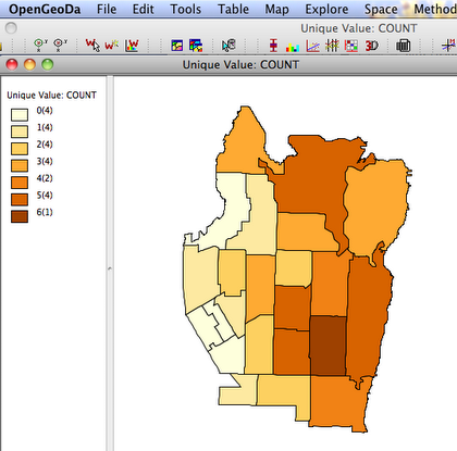
We already know the distribution of play areas, but we would like to add data on the juvenile population to better determine which neighborhoods are underserved.
The first step to considering population characteristics is to join additional data downloaded from the US Census American Fact Finder. GeoDa requires that table data is in the D-Base format, which usually requires an extra step to convert from the delimited text files downloaded from the census. Older versions of Excel (2003) and many database or statistics programs can convert files to the D-Base (.dbf) format.
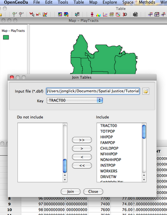
Once we have acquired data in the D-Base format, GeoDa is used to join it to the map using a common identifier or “key” field. In the join tables field, move all needed variables to include as shown above. The join allows us to map the population of children in each tract.
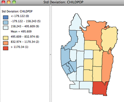
The population count of children is displayed using the Standard Deviation map, with lower counts in blue and higher in red. There are very different number of children in different tracts, so we will want to reconsider the distribution of play areas relative to demand. One way to relate the number of children to the number of playgrounds is to create a rate map, found in GeoDa under the Map>Smooth>Raw Rate menu.
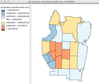
The map of rates, displayed by standard deviation, combines information from the previous two maps and highlights tracts with relatively low or high number of play areas per child. GeoDa offers several tools for comparing the distribution of two variables, and another useful tool is the scatter plot. Using the scatter plot tool, we can graph the play area counts with the population of children in each tract.
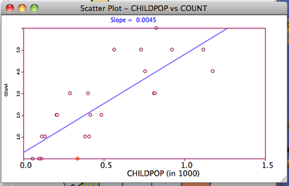
The Y-axis gives the count of play areas and the X-axis indicates the number of children in the 1000’s. We can now see that most of the tracts with no nearby play areas have relatively few children, although there is one with several hundred. The circles below the regression line can be interpreted as tracts with a lower than expected number of play areas, or relatively under-served areas. By clicking on the graph we can select (highlight) the one tract that appears to have the greatest need. We will explore some additional characteristics of this under-served tract in the next steps.
INCOME DIFFERENCES: SPATIAL AUTOCORRELLATION AND HOT SPOTS
Income differences across neighborhoods, regions, or nations are a common area of concern in spatial research. We will now consider the distribution of income in our play ground neighborhoods.
A first step is the create a standard deviation map of median household income. The previously selected “under-served” tract remains highlighted on the map.
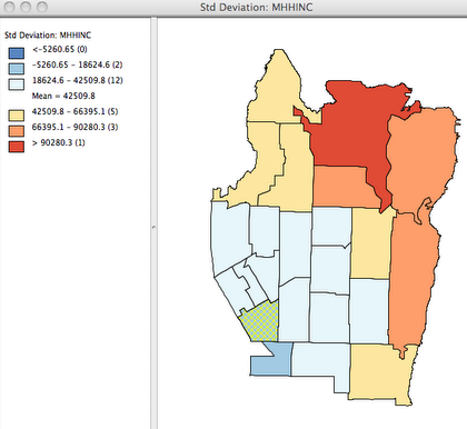
There appears to be a clear pattern with lower income tracts in the southwest and higher income tracts in the northeast. It is a truism that nearer data points are likely to be more similar, but it is still common to treat separate neighborhoods or regions as independent data. A more spatially sophisticated approach is to analyze the degree to which nearby data is inter-dependent (Spatial Autocorrelation) and describe any spatial clusters that exist (LISA).
The first step to measuring spatial relationships in GeoDa is to create a spatial weights file. The weights file defines the relationship between points and can be specified in several ways.
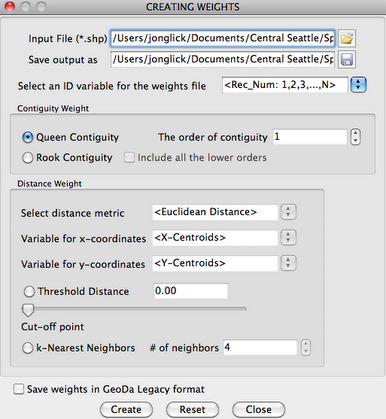
In this example, we opt for the most simple measure of spatial relationships, which is 1st order continuity. Tracts are considered “nearby” to another if they share a border. The weight file is then saved and used in later steps.
Spatial Autocorrelation for the median household income variable is depicted by a Moran’s I plot. This plot uses the contiguity weight just created to compare income in a tract to income in neighboring tracts.
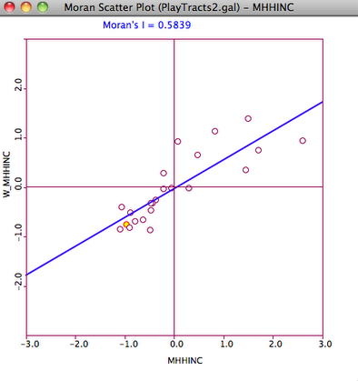
Positive spatial autocorrelation is indicated by the positive slope of the fitted line, and the positive value of the Moran’s I statistic. The concentration of data points in the top right and bottom left quadrants indicates that tracts with high income are nearby other tracts with high income and vice-versa.
Local Indicators of Spatial Autocorellation (LISA) can be mapped in order to visual significant clusters of values. The cluster map below is produced with the Univariate LISA command in GeoDa.
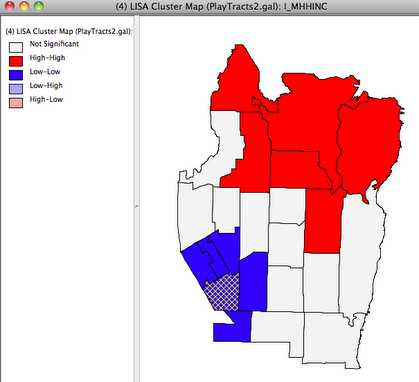
The LISA clusters clearly visualize the high degree of spatial autocorrelation in this data. The “High-High” cluster is a statistically significant grouping of of high income tracts and the “Low-Low” cluster is a grouping of low income tracts. Significantly mixed “Low-High” or “High-Low” clusters do not exist in this case, but would represent negative spatial autocorrelation. The neighborhood least served by play areas remains highlighted on the map, and is clearly in a “Low-Low” cluster of relatively poor Census Tracts. We can now conclude that this particular neighborhood is disadvantaged in terms of childrens’ access to play areas as well as area household income.